INSIGHTS
Browse our blogs, news, and thought leadership shaping the future of digital marketing and communications.
Filter
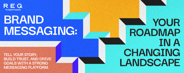
BLOG
On the Radar


News
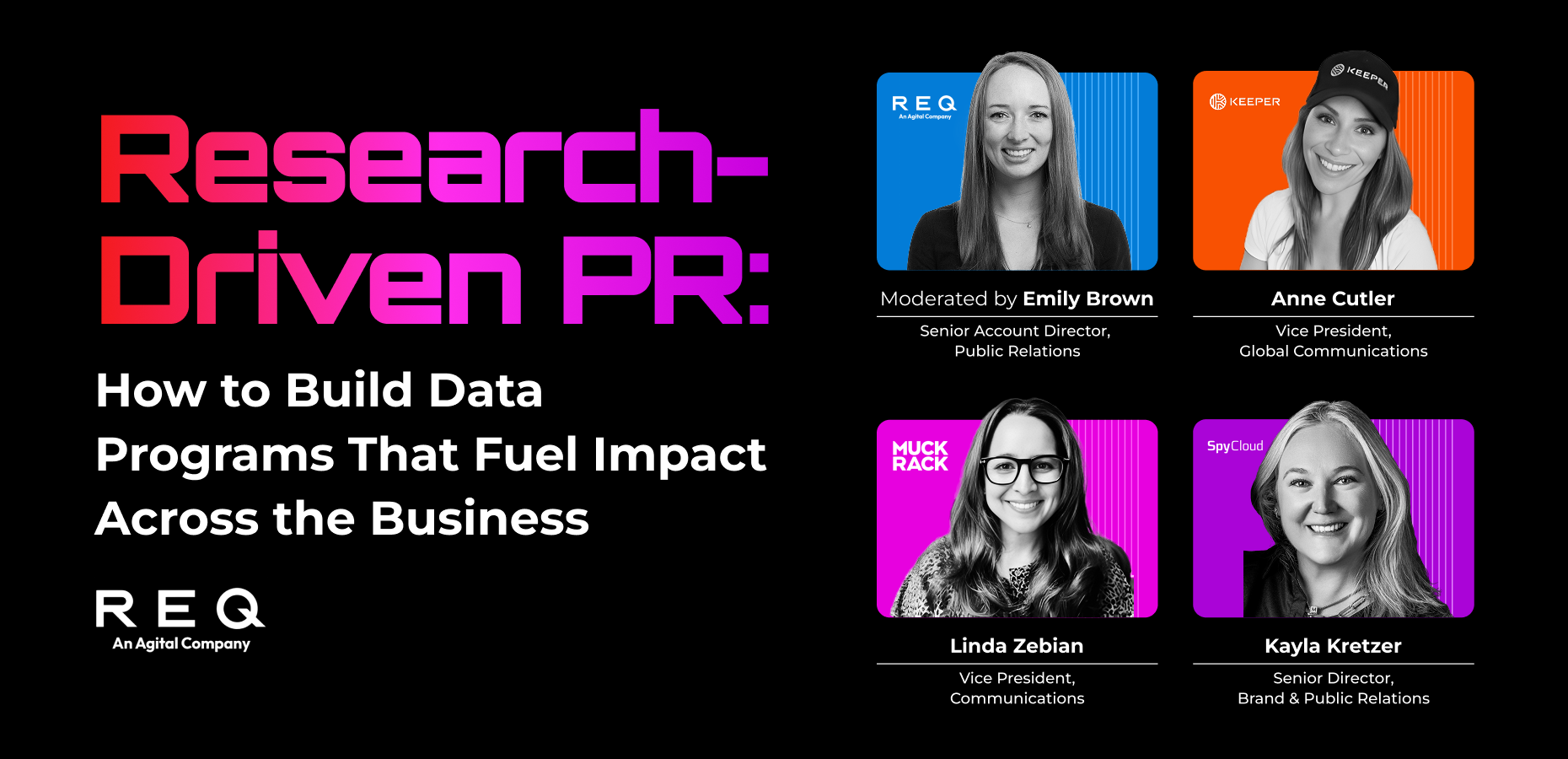
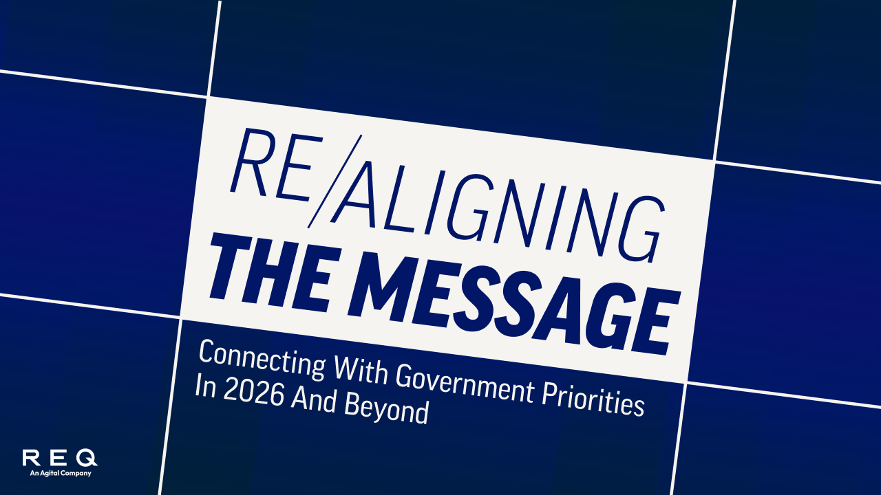
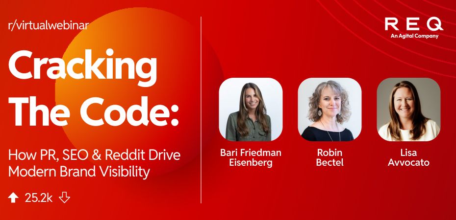
Webinars


CONTACT US
CONTACT US
WE HELP BRANDS OWN WHAT’S NEXT
Our integrated PR and digital campaigns build reputations, drive growth, and shape conversations that define markets. Let’s talk about how we can help you do the same.