July 24, 2015
| Article | Design,
Search Engine Optimization
Navigating Your New Mobile Friendly Website
Responsive design: What was once the frontier in mobile is now a standard part of business and content strategy for companies of all sizes.
With the rollout of Google's Mobile Friendly Algorithm, it's become more important than ever to make your content easy to navigate on mobile. But how do you do that?
As a professional UX designer, I spend my days answering this question - among others - for our clients. Here are some navigation tips and best practices that I rely on throughout the redesign process to produce an excellent experience for users, on any device.
Mobile Context Design Tips
(1) Trim the Fat
Start by taking a fresh look at how the user navigates the content. Most likely there's a legacy to why certain items are in the header and primary navigation. Given today's user-centered design and mobile context, be flexible and rethink the whole information architecture. Edit the primary navigation choices, keeping only what's essential and relevant for the user to understand your product and services. Remove the nonessential navigation items from the top level to play supportive roles at relevant points along the user flow.
Below you'll find the responsive website for Dorigati Wines. Notice the four breakpoints of differently designed interfaces for the primary navigation - these breakpoints render the content flexible and usable on many devices. Be careful though, as this seems to be an exercise in designing for devices instead of designing engaging contextual content. The takeaway: when you make your site mobile friendly, your previous information architecture might not work anymore.
Dorigati Responsive Navigation UIs
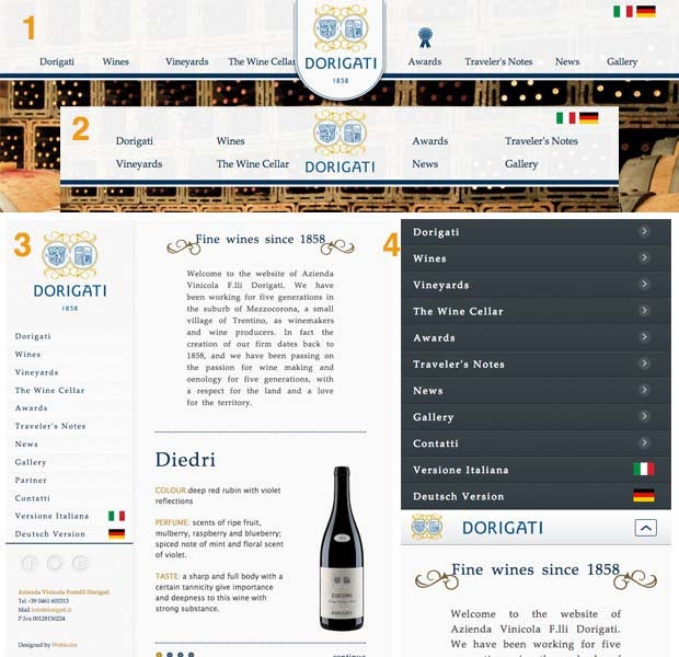
1- large desktop width, 2- small desktop width, 3- tablet range, 4- handheld range
Your design choices can have a real effect on your bottom line. Forrester Research has estimated that as many as 50% of online sales are lost when users can't find the information or products they want. Guide your re-architecture by user behavior and needs. Take a look at your analytics to give priority to the information at each level of the site map and bring popular content and actions to the top of each user flow defined by user research.
Addressing Consumer Concerns
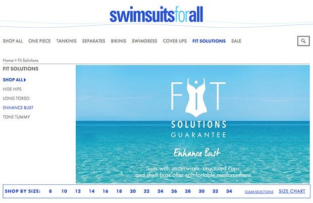
Swimsuitsforall.com addresses consumer needs with an emotional connection. The "Fit Solutions' category describes product features that satisfy customer needs at the beginning of the product search. This great example demonstrates well-thought-out content strategy and navigation UIs, which inspire confidence in users while making it easier for them to discover solutions and make a purchase.
(2) Reduce digging
For even shallow information architecture on the smallest screen, rely on a combination of navigation elements and test different UIs specifically for mobile. You want your navigation UIs to be obvious, useful, and friendly - cut out complex and repetitive motions by displaying your navigation elements in useful page locations. The visibility of navigation systems will change in relation to the primary content on mobile, but finding the options should be easy.
Quick Tip: Creating dynamic and contextual content blocks for related information will lessen the burden on navigation UIs and assist the primary message.
Responsive websites require adaptive content and navigation UI patterns. The William & Mary University responsive website exemplifies many of these tips.
Article template relies on a combination of navigation elements
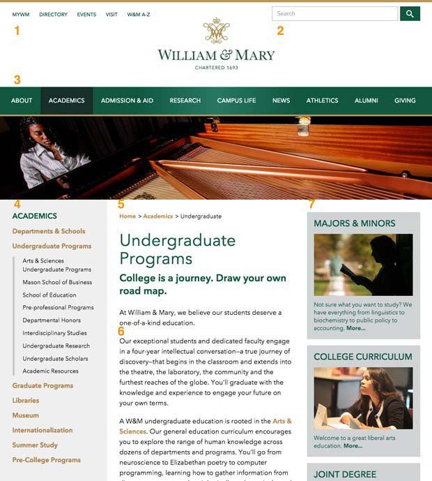
Internal article template on desktop 1. Utility navigation, 2. Search, 3. Primary navigation, 4. Local navigation, 5. Breadcrumbs, 6. Focused content and page links, 7. Continued related conversations 8. Helpful links footer (Not highlighted)
Quick link to local navigation
On the mobile version of the article template, the 'Page Menu' button prevents repetitive scrolling to the local navigation, now positioned at the bottom of a long single column.
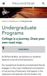
1. The 'Page Menu' button
Fewer options for visual relationship
Note that on the smallest screens, the primary and local navigations aren't present, but the breadcrumb navigation clarifies the relationship of the page content to previous conversations in the content flow, essentially covering for the primary nav UI and outlining the expectations of content for this page. When we associate the title 'Undergraduate Programs' with the broadly labeled section of 'Academics,' there is an expectation of how much detail (or introductory-level content) there will be on this page.

Breadcrumb navigation circled
(3) Design with User Expectations
We've been designing responsive websites long enough to know that user expectations are different on each device.

In this version of the responsive header, you'll notice that the mobile navigation UI focuses on the tools previously located in the utility navigation on desktop. These tools now serve as the first choices in the menu drawer. In this mobile context, the links in the utility navigation are given priority over the primary navigation on the desktop UI.
Adaptable menus like this can even exceed user expectations when users find the actions they perform more frequently on mobile front and center in the navigation. This experience will positively impact users' perception of your brand, and will help to establish you as a leader in your industry.
Bonus: Test Your New Architecture and Responsive UI
Now that you've invested time in redesigning your information architecture and developing your mobile friendly website, we advise following up with usability testing to define the most effective display beyond best practices.
An example of this testing can be seen in the following IBM home page variations, where a multivariate test of the header UI design determines the most customer-satisfied design.
[caption id="attachment_1228" align="alignnone" width="540"]=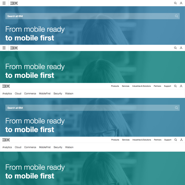 IBM Multivariant Test for Header Designs[/caption]
Navigating Success
While Google has turned up the heat on the mobile marketing initiatives and your SEO may be taking a hit, take heart - this is only a temporary hiccup. RepEquity knows you're not alone: from Fortune 100 websites to your competition down the road, everyone is adjusting to the new algorithm. RepEquity can address these new requirements while providing flexible solutions to help you reach your ultimate goal - meeting your users' needs.