December 18, 2014
| Article | Online Reputation Management,
Search Engine Optimization
Landing Page Best Practices in the Real World
Pay-per-click advertising is an indispensable tool to have in your lead generation toolbox: not only does it increase brand awareness, but it brings qualified leads to your website. However, if a potential customer clicks on your ad after searching 'new countertops' and is routed to your expansive homepage, you've immediately lost them. That's where landing pages come into play - targeted landing pages help connect the right customers to your product, and allow you to capture information about those potential customers in order to follow up and complete the sale.
Landing Page Best Practices
A poorly-optimized landing page can cause you to miss sales and lose customers. Below, we've assembled a short list of best practices that will help eliminate confusion and drive conversions:
- Display the form above the fold of the page
- Make sure the form is not too long, include as few required fields as possible
- Have one, clear call to action and place it prominently on the page
- Include trust-building content such as videos, customer testimonials, satisfaction rates or company awards
- Make sure the copy on the page is clear and succinct
- Use directional cues to draw attention to your call to action
- Give people the option of filling out a form or calling a direct line
Client Case Study
One of our clients, a regional interior home improvement business, came to us in early 2014 for a website redesign, and we continue to advise them on their lead generation campaigns. They have a single PPC landing page that drives leads, and they allow us to perform a variety of tests on this vitally important page to maximize its effectiveness. Since we launched their new website in the spring of 2014, we've increased leads via PPC by 80% and 40% of their business leads now come through this landing page.
How did we do it? By testing, testing, testing! Here's a look at two of the landing page tests we've conducted for this client:
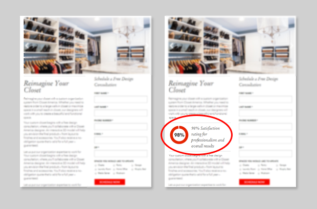
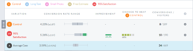
In July, we asked the client to provide some statistics they had gathered through a customer satisfaction survey. One of the strongest numbers they had was their 98% satisfaction rate. Rather than burying this impressive statistic in the copy of the page, we had our designers create a simple, eye-catching graphic highlighting the percentage and dropped that into the page to break up the text (remember, the easier and more digestible the text is, the more likely it is that someone will convert).
The chart below shows the success of this addition. Just after we began our test, we saw a huge increase in the conversion rates for the page that included the graphic. A spike in conversions, like the one pictured below, is very typical of A/B testing. When a test first begins, there is very little data available, which causes the percentage to look a lot higher. Over time, as a page receives more visitors and more conversions, the split tends to even out. As you can see in the chart, our variation page is still performing better than the control.
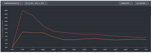
Adding this graphic increased the conversion rate by over 1%, bringing it from 4.23% to 5.26%. For a client like ours, an increase of just one percentage point can lead to tens of thousands of dollars in revenue. We were very happy with this test and the 98% satisfaction rate graphic has become a permanent feature on the page.
In October , we decided to perform another test for the same client, on the same landing page. We heeded a landing page best practice (drawing the viewer's attention to the form's submit button), and added a red arrow to the page pointing to the call to action.
![]()
After two months of testing, both pages are performing nearly the same. While we saw an initial jump in the conversion rate of the variation page, the control page took over and was the top performer for about a week before the two pages leveled out. Ultimately, we talked with the client and decided that the addition of an arrow was not worth keeping.
![]()
This is a good example of why we test so many landing page variables instead of blindly adhering to best practices. Even though drawing attention to the call to action is a best practice, it may not work for your audience base.
Let Us Help!
Landing pages can be tricky and time consuming for companies to manage on their own. Small mistakes or poorly-optimized pages can have a huge impact on your business. By partnering with RepEquity, you can focus more on your qualified leads and leave the construction, implementation and testing of the pages to us.