INSIGHTS
Browse our blogs, news, and thought leadership shaping the future of digital marketing and communications.
Filter
BLOG
On the Radar
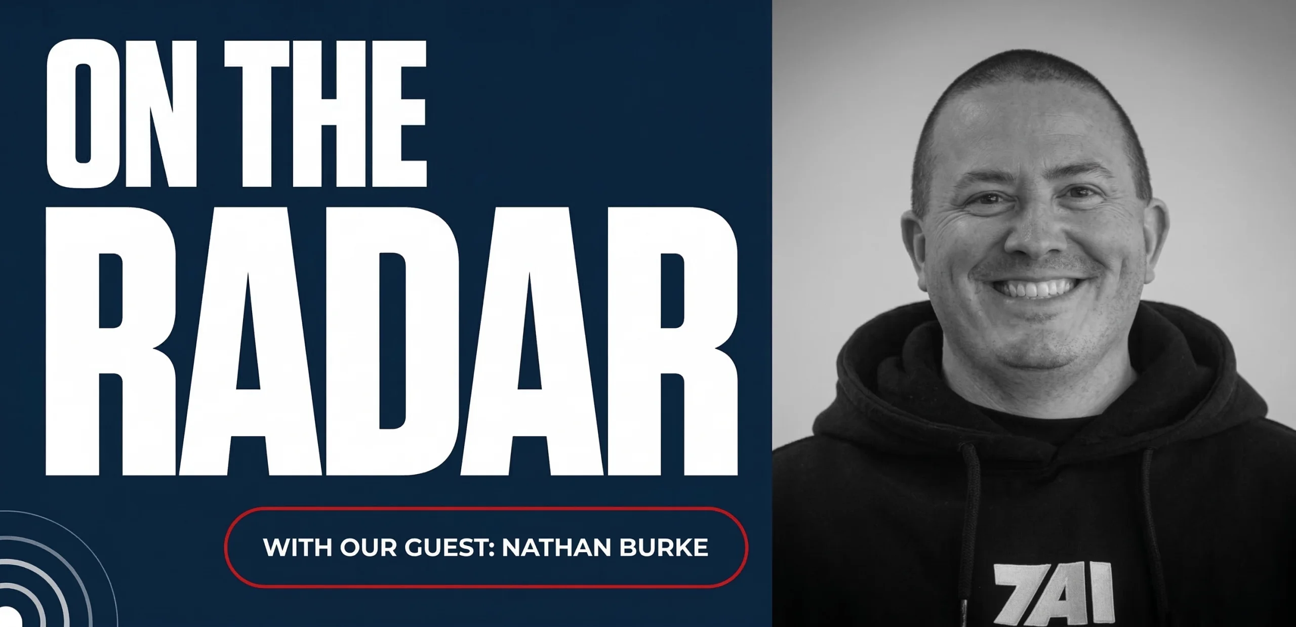
The CMO Who Gave Up Sales Pitches to Build Real Relationships
Chatting with Nathan Burke of 7AI on why relationship-building outperforms traditional B2B marketing Nathan Burke is intentionally doing less of what most B2B marketers are taught to do. As CMO of 7AI, he’s opting out of the usual B2B playbook, the awkward steak dinners with a pitch attached, the conference badge scanning arms race, and…
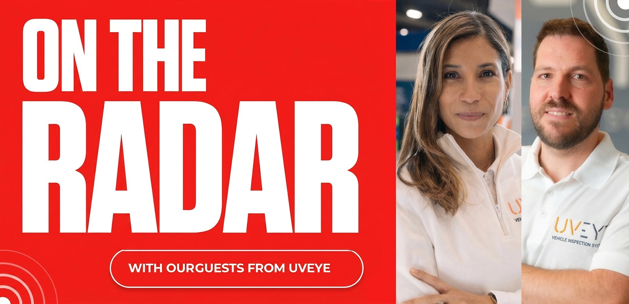
How UVEye’s Unicorn Drives Trade Show Excitement
Trade shows are crowded. Competitive. Expensive. Every booth promises innovation. Every brand is trying to stand out to the sea of overwhelmed and tired attendees. For AI-driven vehicle inspection company UVEye, standing out meant not just thinking creatively. It meant creating a unicorn. UVEye calls its technology an “MRI for cars.” It provides AI-driven technology that…
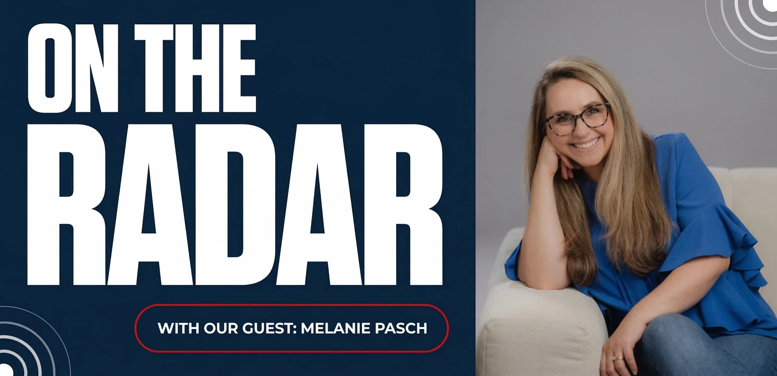
How WalkMe’s Melanie Pasch Humanized the Enterprise AI Adoption Problem with “AI Shame”
Ask an executive how many software applications their company uses, and they’ll probably guess 30 or 40. The average organization, according to research by digital adoption platform (DAP) pioneer WalkMe, actually runs about 625 applications. This staggering digital ecosystem is where most tech investments stall, not because the technology is poor, but because employees can’t…
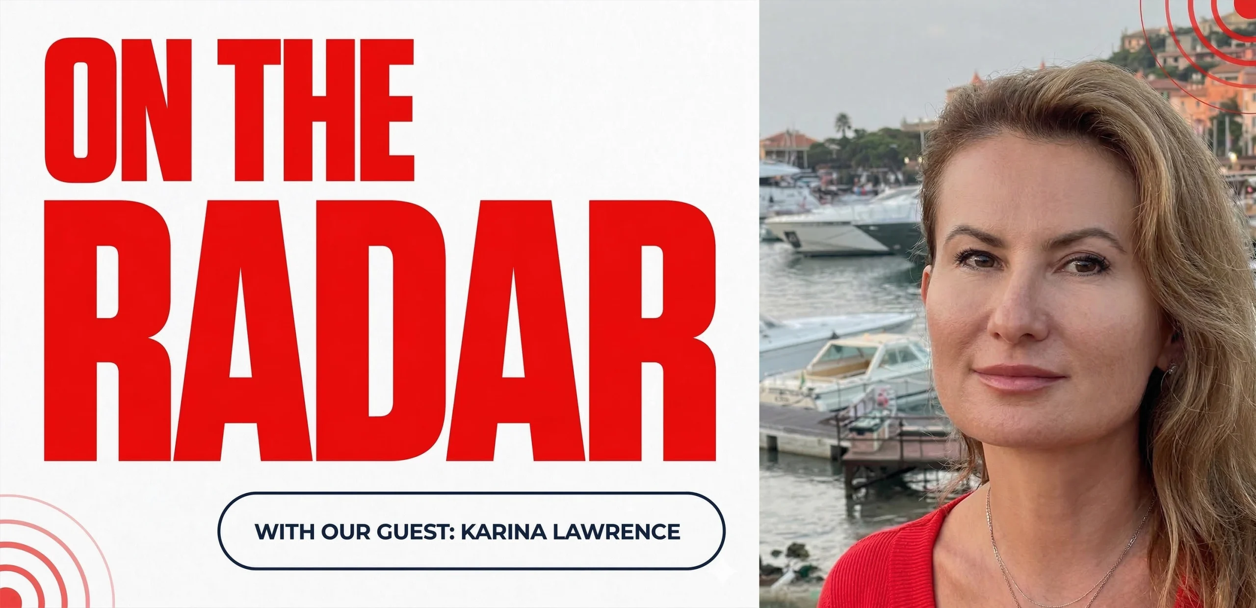
From $200M ARR to Pre-Seed: How Karina Lawrence Rewrites the Marketing Playbook for Early-Stage Startups
When you’ve helped scale a developer-focused company from roughly $200M to nearly $250M in ARR, you know what “grown-up” marketing looks like. Today, though, Karina Lawrence is back at the very beginning—leading marketing at Macrovo, a pre-seed, ~10-person startup that blends AI and human expertise to help financial institutions make faster, smarter decisions. It’s a…
B2B Videos You Actually Want to Watch? Meet Jared Evers of Medallia.
For Jared Evers and his small and scrappy content team at Medallia – provider of customer and experience software – if you can’t do something stellar, there’s no sense in doing it at all. For proof, check out how the team is pushing the boundaries of corporate videos with Experience Now, Medallia’s own streaming platform.…
How HII’s Jaime Orlando Builds Connection, Culture, and Momentum Inside a Legacy Brand
Q: Jaime, for those who might not know HII Mission Technologies, can you give us a quick overview of what your team does? Jaime Orlando Absolutely. HII as a company has an incredible legacy. It’s America’s largest shipbuilder, with more than 135 years of experience. About 75% of HII’s business comes from shipbuilding at our…
How Jenifer Kern Helped Qu Redefine Restaurant Tech
On the Radar sat down with Jenifer Kern, CMO of Qu, to talk about how she helped create a new category in restaurant technology, why maintaining industry focus has been key to business growth, and what it means to elevate marketing in a longstanding industry undergoing rapid transformation. Q: When you joined Qu, what did the industry…

From The New York Times to Muck Rack: Linda Zebian on Knowing What’s Newsworthy
Linda Zebian knows how to tell a good story. As VP of Communications at Muck Rack, she leads a lean, high-impact team responsible for brand, content, product marketing, internal comms, and more. Her approach is grounded in the instincts she developed over 10 years in corporate comms at The New York Times, where she learned…
How Sam Baldridge is Turning Culture Into a Competitive Edge
At Applied Systems, Sam Baldridge wears a lot of hats. Officially, she’s the Senior Communications and Culture Specialist. Unofficially, she might be better known as the “Vibes Director.” Sam is part of a small but mighty three-person team tasked with building internal connection, shaping employer branding, and turning culture into a competitive advantage. We caught…

How Kristina McConnell Uses Precision and AI to Power Account-Based Marketing at H1
A Director of Marketing at H1, Kristina McConnell brings structure, creativity, and a test-and-learn mindset to every campaign she touches. With a small team and a niche audience in the pharma space, she has helped transform H1’s account-based marketing (ABM) approach into a tightly aligned, data-driven engine. Her team goes far beyond basic alignment with sales.…
News
Webinars
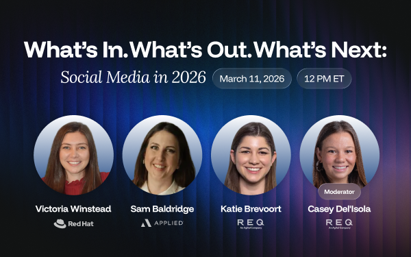
What’s In. What’s Out. What’s Next: Social Media in 2026
Overview: As budgets tighten and performance expectations increase, social media strategy in 2026 requires smarter prioritization—not more content. This webinar explains which trends are driving results, what tactics are losing effectiveness, and how brands can adapt to changing audience behavior and platform dynamics. Key Takeaways: Who Should Watch: Marketing leaders, social media managers, and B2G…
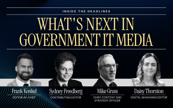
Inside the Headlines What’s Next in Government IT Media
Overview: As government agencies accelerate modernization across civilian and defense sectors, the media landscape covering public-sector technology is evolving rapidly. This webinar explores what government IT journalists are prioritizing in 2026 and how organizations can align their messaging to earn credible, relevant coverage. Key Takeaways: Who Should Watch: PR professionals, communications teams, and government contractors…
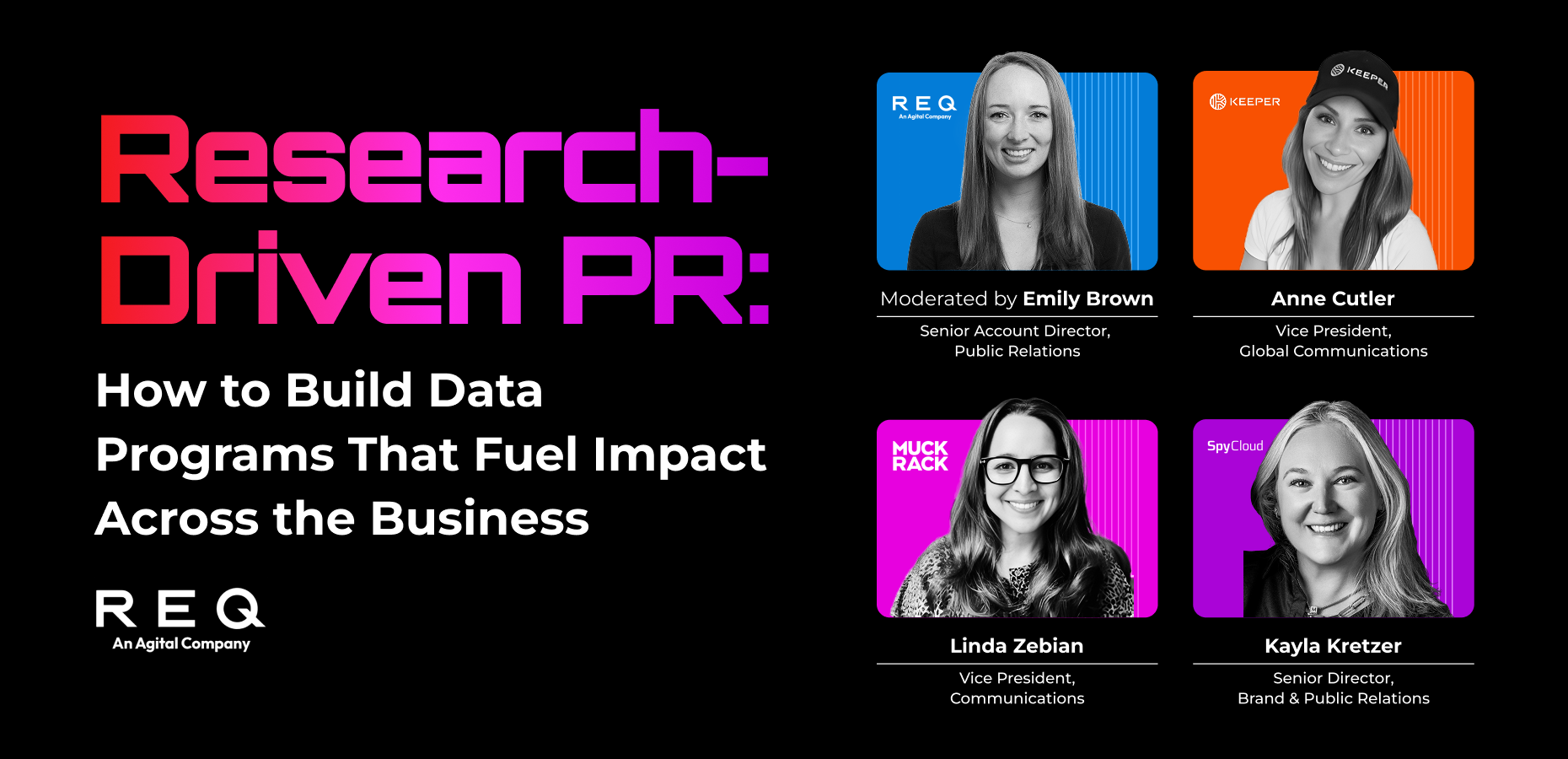
Data That Drives Headlines: Best Practices for Research-Backed PR
Overview: Learn how to design research and surveys that generate media coverage, strengthen brand authority, and support lead generation. This webinar breaks down how organizations use data to create compelling PR narratives that consistently attract journalist interest. Key Takeaways: Who Should Watch: PR professionals, marketers, and content strategists looking to elevate their storytelling through research-backed…
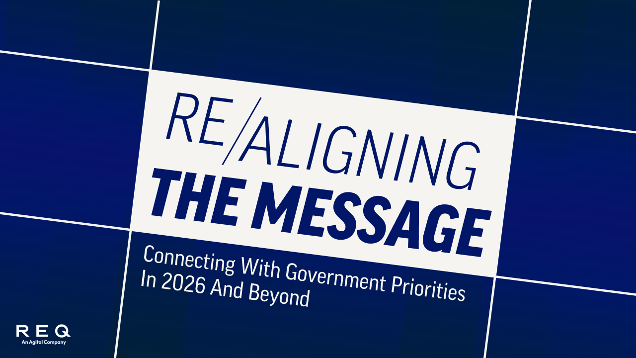
Realigning the Message: Connecting with Government Priorities in 2026 and Beyond
Overview: As federal priorities shift toward defense readiness, digital sovereignty, and mission assurance, organizations must adapt how they communicate their value. This webinar explains how to align messaging with evolving government priorities to build credibility and win attention in a competitive landscape. Key Takeaways: Who Should Watch: B2G marketers, executives, and communications professionals seeking to…
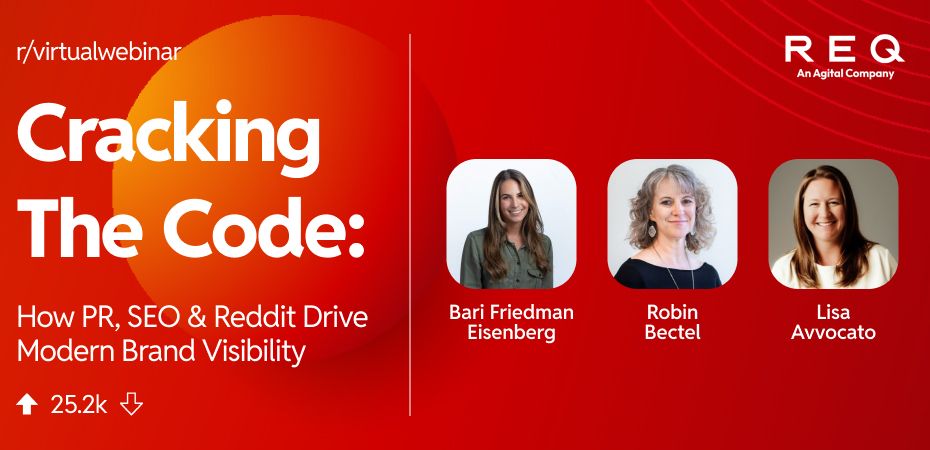
Cracking the Code How PR, SEO, and Reddit Drive Modern Brand Visibility
Overview: Reddit has become a powerful driver of search visibility and a key source of training data for AI systems. This webinar explores how brands can integrate Reddit into PR and SEO strategies to build authority, earn trust, and influence the narratives that shape modern search results. Key Takeaways: Who Should Watch: SEO specialists, PR…
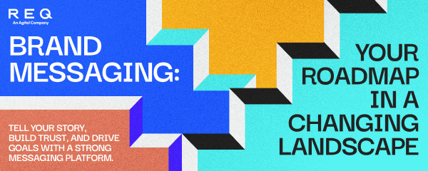
Brand Messaging: Your Roadmap in a Changing Landscape
Overview: In a rapidly evolving market, clear and consistent brand messaging is essential for building trust and standing out. This webinar explores how organizations can refine their messaging to align with audience expectations, emerging technologies, and competitive pressures. Key Takeaways: Who Should Watch: Marketing and communications professionals looking to strengthen their brand positioning and improve…

Standing Out in a Sea of Sameness: A Fresh Look at B2G Branding
Overview: In an increasingly crowded government marketplace, strong branding is essential for differentiation. This webinar explores how B2G organizations can elevate their brand, clarify their value, and stand out to government buyers. Key Takeaways: Who Should Watch: B2G marketers, brand strategists, and executives looking to strengthen their positioning and visibility in the government market.
WE HELP BRANDS OWN WHAT’S NEXT
Our integrated PR and digital campaigns build reputations, drive growth, and shape conversations that define markets. Let’s talk about how we can help you do the same.