March 29, 2018
| Article | by REQ Marketing | Design
10 Tips for Designing a Cringeworthy Infographic
Infographic design is meant to provide information and content in a more visually appealing way. Many online readers are skimmers. They will breeze through your content until something catches their eye and makes them want to stop. Sometimes this is a catchy headline. But typically, it’s an image or video that is going to be the reason for someone to stop scrolling.
Infographics can complement your written content or stand on their own to illustrate a specific topic. They can vary in length and size and are a good way to transform what can be perceived as boring data into something more interesting.
When it comes to creating visuals for your digital marketing campaigns, do you follow a certain format? Are you churning out the same kind of infographic design time and time again? As a result, do you feel like your creative output has become a little stale?
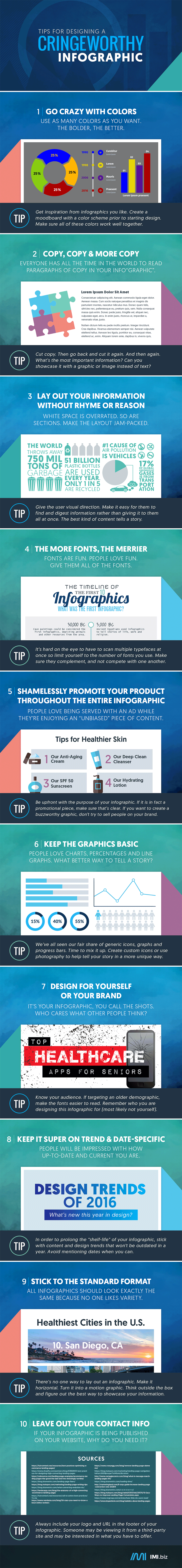
We’ve all been there, which simply means it could be time for a refresh. In order to demonstrate what not to do, we’ve put together our own infographic with infographic guidelines. First, the infographic design reveals what kind of tactics will most likely make your audience cringe. Crazy colors, overwhelming copy, multiple fonts – these things will turn off your audience.
Fortunately, you’ll then see the solutions we’ve provided to common problems; plus, tips on how to create your own infographic that performs better and improves engagement with your content. Since people consume content in different ways, it’s best to provide variety whenever possible. It will make you more attuned to your audience’s wants and deliver the kind of content they want to take time to read.